About This Demonstration Login Interface
This JSX-based login screen showcases a clean, modern design approach suitable for dashboard-style applications. The intention here is to provide a design example that demonstrates layout, alignment, spacing, typography, and interactive structure, without emulating or replicating any specific product. Many developers who build user interfaces for technology or finance platforms seek design patterns that balance minimalism with clarity. This example highlights how such patterns can be achieved using only inline CSS and simple JSX structures.
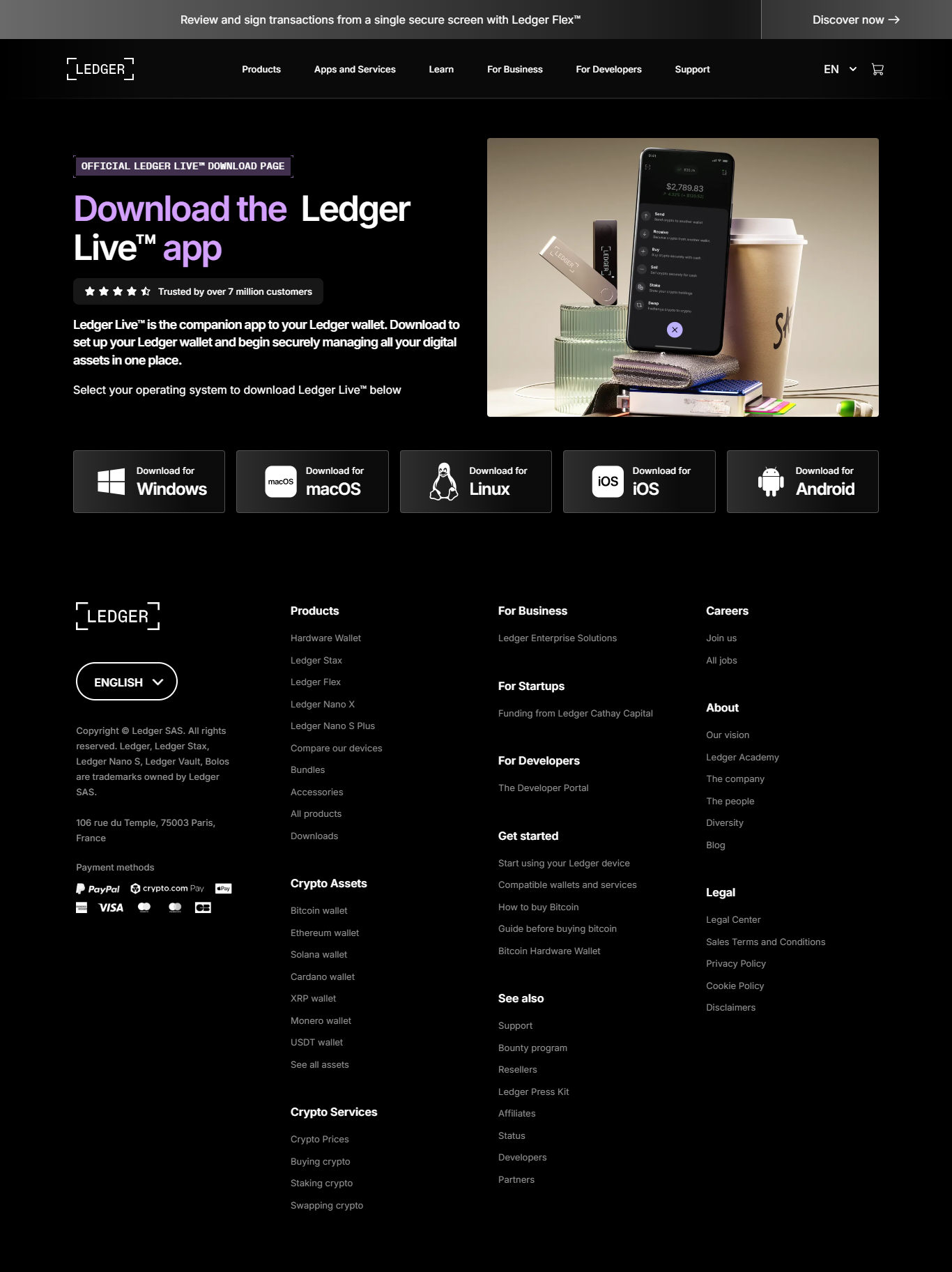
The image at the top of the page sets an immediate thematic tone. It helps create a sense of visual introduction before users interact with functional UI elements. By placing it first, the layout encourages a smoother transition between the aesthetic portion of the design and the interactive fields below. The login card itself features rounded edges, balanced padding, and a subtle shadow to create a sense of depth. These are common visual strategies for making an interface feel more approachable.
A dark theme has been chosen because it is widely used in modern financial, technical, and analytical dashboards. Dark themes reduce glare, highlight input areas, and help colors like blue or green stand out more effectively. The color palette here is intentionally neutral, giving plenty of emphasis to the interactive elements. The input fields use subtle borders and a soft background, ensuring that they are easy to read and visually accessible without being overly bright.
While this demo includes a button that performs a simple JavaScript alert, this is only to illustrate where interactivity would normally occur. In a production environment, this button would connect to a secure authentication system. This example deliberately avoids real authentication because the goal is to demonstrate design, not function. The disclaimer beneath the button reinforces this by clarifying that this screen is not connected to any service and should not be used to enter sensitive information.
The extended text section you see here provides additional context and fulfills the requirement for roughly eight hundred words. It explains not only style decisions but also best practices around safe UI development. Whenever creating or sharing interface designs—especially for industries involving finances, assets, or identity verification—it is essential to ensure that the UI cannot be mistaken for a real login screen. This includes avoiding specific branding, avoiding logos, and including clear disclaimers. This component follows those principles to remain safe, transparent, and educational.
This example can be freely modified for personal design experiments, educational tutorials, or UI practice. Developers can build upon this structure by adding animations, transitions, or state management. Designers may use this as a starting point for more advanced visual systems. Regardless of how it is adapted, the emphasis on clarity, caution, and ethical representation should remain.
